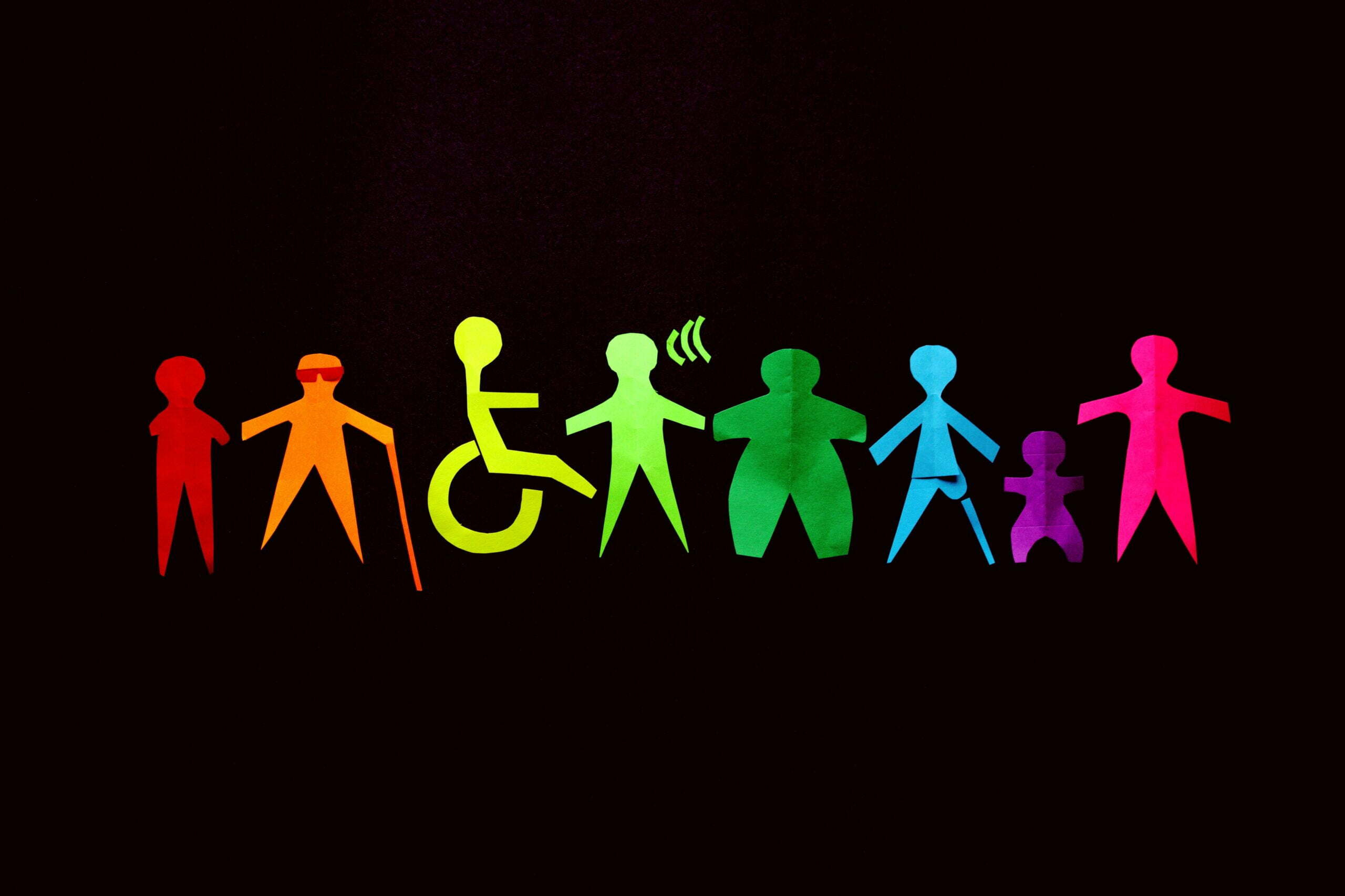
In User Experience (UX) Design, the user is always front and centre. The UX design team needs to know their users’ characteristics, goals, pain points, and accessibility requirements. This helps create inclusive design experiences that empower all potential users, including those with overlooked needs due to their different abilities and backgrounds.
In this blog, I will cover the following:
- What is accessibility?
- Why design for accessibility?
- What is assistive technology?
- Guidelines for creating accessible designs
- Additional resources for accessible designs
- In a nutshell
Let’s jump in!
What is accessibility?
Accessibility is the concept of creating content, applications and other products that everyone can use (see Human Centred Design), including people with disabilities. An accessible design provides an equivalent user experience to all users, no matter how they may choose to interact with a product or service.
To benefit as many users as possible, the design team needs to consider the following questions:
- Do the users have any temporary, situational or permanent impairments?
- Are the users familiar with technology?
- How, when and where are the users accessing the product or service?
- Is all demographic data considered for the users: income level, age, gender, ethnicity, education, and geographic location?
Why design for accessibility?
User Experience design for accessibility brings benefits to all users. Accessibility features that benefit people with disabilities often aid other people too.
For instance, closed captions help people with hearing difficulties and also allow users who are trying to watch a video on mute (e.g. while waiting at a doctor’s office).
Another example is using high-contrast text that helps people with visual impairments. It also allows other users to read high-contrast text easily while out in bright sunlight.
Designing for accessibility also has the following benefits:
- Better search results,
- Reach a bigger audience,
- More SEO (Search Engine Optimisation) friendly,
- Faster download times,
- Better usability, and
- Enhanced brand image.
Learn more about designing a human-centred experience:
What is assistive technology?
Assistive technology is any product or software that increases, maintains, or improves the functional capabilities of people with disabilities. (Source: ATIA)
Following are some of the commonly used assistive technologies:
- Colour modification – High contrast mode or dark mode on a device. Colour modification makes the interface easier to see.
- Voice control and switch devices – Such devices help people with limited dexterity and can be used as an alternative to a keyboard and mouse.
- Screen readers – The software reads aloud any text on the screen and aids people with limited vision.
- Alternative text – Helps describe images for people with visual impairments. Also useful for people with low bandwidth internet connections.
- Speech-to-text – Helps users with physical and visual impairments to communicate efficiently.
Guidelines for creating accessible designs
The following guidelines are easy to implement and can help you get started with creating inclusive and accessible designs:
1. Include enough colour contrast
This guideline helps users with colour blindness, low vision, or other vision impairments to see and read the text. I recommend using Color Safe or WebAIM to test whether your chosen colours adhere to the WCAG guidelines.
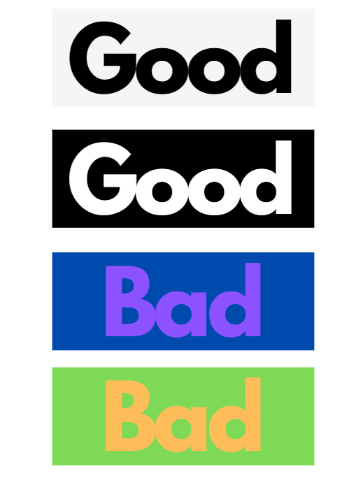
2. Try using indicators other than just colour to make critical information understandable (e.g. text labels, patterns, etc.)
This guideline aids users who have difficulty distinguishing one colour from another, including those with low vision or who are colour-blind.
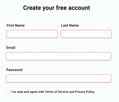
Consider the following example. If the screen is grayscale, could you tell how many fields are in an error state?
‘How many error fields can you spot in grayscale?
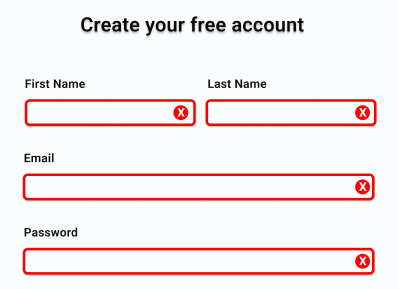
Now, let’s take a look at this same screen in colour. Can you now count how many fields are in an error state?
Turning on the colour reveals a different story altogether.
There are various methods to make things visually accessible – using symbols, bolder text, thick borders, underlining, italics etc. The only rule is to use more than just colour.
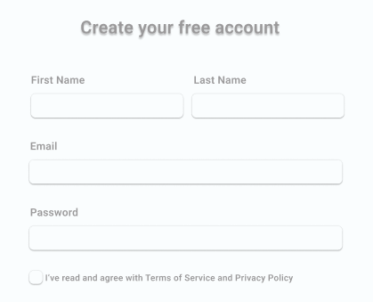
3. Don’t use placeholder text as labels
Labels tell users the purpose of the field and the information required. Placeholder texts are usually of low contrast, and the text usually goes away when you click on the field, making it confusing for the user.
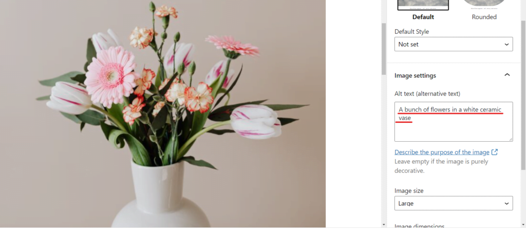
4. Write helpful alt text for images
Alternative text or alt text describes an image or non-text element to people who don’t have the ability to see the images.
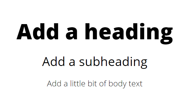
5. Use headings and other correct markups to establish content hierarchy
Headings communicate the content hierarchy and make it easier for a screen reader to provide accurate in-screen navigation.
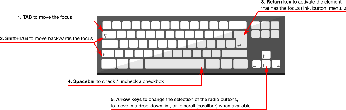
6. Support keyboard navigation
Keyboard accessibility is essential for users with motor disabilities who might not be able to use a mouse for navigation. Blind or visually impaired users also use keyboards for navigation.
Additional resources for accessible design
I recommend the following resources to get started with the basics of accessible design:
- Design That Benefits Everyone includes good examples of inclusive and accessible designs.
- 7 things every designer needs to know about accessibility is a fantastic blog highlighting good inclusive-design practices.
- Web Content Accessibility Guidelines (WCAG) 2.0 includes a variety of recommendations for making the web more accessible.
- The Accessibility guide for Google Material is an excellent resource for familiarising accessible design principles.
- Accessibility features for Windows and Apple products.
In a nutshell
Designing for accessibility is not only the right thing to do; it also benefits all potential users. I believe that every designer should understand the importance of creating inclusive and accessible products and why creating for under-represented user groups is a must.

