
For decades, the humble desktop PC has been the most preferred platform for users worldwide to access their favourite websites and applications. The last few years have seen a rise of various other platforms (phones, tablets, smart displays). However, smartphones have emerged as a clear winner when considering the number of users. To cater to this rising demand, UX designers must give Mobile UX Design the attention it deserves.
In this blog, we will cover the following:
- What is Mobile UX Design?
- Responsive vs Adaptive Web Design
- Guidelines for Designing Mobile UX
- In a nutshell
Let’s get into it!
What is Mobile UX Design?
Mobile User Experience (UX) design is designing experiences for hand-held and wearable devices. An excellent mobile UX design focuses on accessibility and efficiency to improve on-the-go experiences for all users. UX designers need to understand that the needs of mobile users are unique and don’t necessarily align with those of desktop users.
Designing a cross-platform experience? These might help:
To cater to these mobile or moving users, it is crucial to consider the following factors:
- Mobile users have smaller screens,
- Attention spans of mobile users are generally shorter than those of desktop users,
- Mobile users often want quick results with minimal effort and delays,
- Mobile users are usually on-the-go, hence are more prone to environmental distractions,
- Signal and power loss of devices,
- Physical limitations such as fingertip sizes, and
- Different technological abilities of various phone models.
Responsive vs Adaptive Web Design
In the past, most mobile websites were just miniaturised versions of their desktop sites, which often made them very hard to use. Today, designers have two approaches to choose from when designing a mobile experience: responsive and adaptive web design.
Responsive vs Adaptive Web Design | |
Responsive Web Design | Adaptive Web Design |
|
|

Guidelines for Designing Mobile UX
When designing a mobile user experience, a designer should consider how the intended device would be used and consider the specifics of the chosen device. Certain guidelines like the ones mentioned below can help one get started, but these cannot substitute the need for conducting user research.
1. Small Screen Size
- If you are designing for multiple screen sizes, you need to decide whether to use responsive or adaptive design.
- A ‘mobile-first’ approach is most helpful. It means one should start designing for the smallest screen size first and then increase complexity.
2. Reduce Visual Clutter
- Due to the limited screen real estate, it is vital to reduce visual clutter.
- It is not feasible to include all the information from a desktop website in its mobile version. Designers need to keep content to a minimum.
- Page descriptions should be kept short.
- To keep the visual experience simple, you also need to structure your content in a single column instead of the multiple columns used for bigger screens.
3. Screen Orientation
- Design for both directions a phone might be held – vertical portrait view or horizontal landscape view.
- Your users should have a seamless experience no matter how they choose to hold their device.
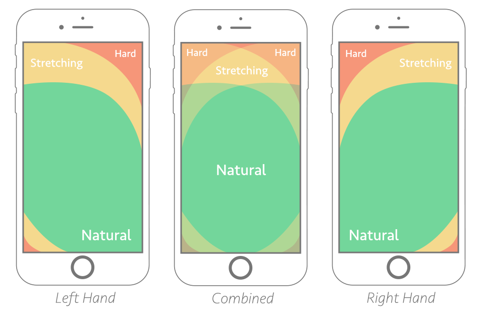
4. Thumb Zone
- Steven Hoober coined the term ‘The Thumb Zone’ in his book ‘Designing Mobile Interfaces‘, describing it as “the most comfortable area for touch with one-hand use.”
- Place all the critical clicks and navigation in the ‘natural’ zone to optimally use the thumb zone. This allows the user to reach the essential areas of the app with one thumb.
5. Simple Navigation
- Navigation menus should be kept short and simple, with the menu options only highlighting the core functions.
- Keep the information architecture of your application simple by minimising the levels of navigation.
- All links should be visually distinct.
6. Call-to-Action Buttons
- Place call-to-action buttons front and centre.
- This allows the user to efficiently complete the desired task, such as adding an item to the cart, joining the mailing list, etc.
7. Minimum Input from Users
- Designers should seek minimum user input to make their experience more seamless.
- Reduce required input fields in forms. When the user logs into a desktop device, you can always ask for more data.
- Only allow scrolling in one direction, and if possible, minimise scrolling altogether.
- Keep URLs short and easy to remember.
- Enable alternate input mechanisms (voice search etc.)
- Make user input more seamless by offering the correct type of input choices. For instance, when a form requests a phone number, only a numeric keyboard should be available to the user, and not the full keyboard. This reduces the chances of error and makes it easier for the user to provide the correct information.
8. Familiar Gestures and Symbols
- Gestures should be intuitive and familiar to users. Use common gestures like tapping or swiping.
- Do not introduce new meanings for common gestures. For instance, pulling down is a familiar gesture for refreshing a page. The motion should not be assigned another meaning.
- Limit the number of action buttons on a screen.
- To make your design fat finger-friendly, use high-contrast colours, make your action buttons large enough and do not place them too closely.
9. Unstable Mobile Connections
- Mobile connection speeds can vary significantly in different places.
- Minimise page size and content for rapid loading.
- Reduce the number of embedded images to speed up load times.
- Retain data to minimise the loss in case of an interrupted connection.
- Avoid using plug-ins that consume vast amounts of bandwidth and data.
10. Seamless Cross-Platform Experience
- Users expect a seamless experience when switching from one device to the other. It is vital to maintain continuity and consistency.
- Maintain your brand image. Your designs should look and feel familiar on all platforms.
In a nutshell
Designing for mobile devices can vary significantly from traditional desktop-based designs. While standard UX and usability factors should still be considered, mobile UX design also brings into focus new design guidelines. UX designers must pay attention to the evolving needs of their audience to ensure they deliver the best possible experience to their users.


Pingback: cheap essay papers