Since the inception of the ‘world wide web’ in 1989, the world has witnessed the continuous evolution of the internet and how we access it. From being limited to only desktops for decades, users can now access the internet through many devices: smartphones, tablets, smartwatches, smart TVs, and even digital assistants. User Experience (UX) designers everywhere face a steep challenge: how to design consistent and user-friendly cross-platform experiences.
A UX designer’s goal is to create products and experiences that users can understand and interact with seamlessly on any device of their choosing.
In this blog, we will cover the following:
- Do we need a cross-platform design?
- Key considerations when designing for different platforms
- Consistency – the secret to a great cross-platform experience
- In a nutshell
Let’s get started!
Do we need a cross-platform design?
When designing a product, a central question that we need to address is, “Do we need a cross-platform design?”
It might be tempting to design for every device with so many platforms available. But it can be a slippery slope since it could be hard to justify the high development costs if most of your target audience does not use these platforms. The app development team must determine which platforms are worth the investment, and user research can help you define your goals and product strategy.
To accomplish a successful cross-platform design, you need to ask the right questions:
- What goal do I want my users to achieve?
- Which platforms can help my users accomplish this goal with ease?
- Which platform is my target audience using?
- How many users use more than one platform/device in a day?
- What time of day are the users on the intended platforms, and how long?
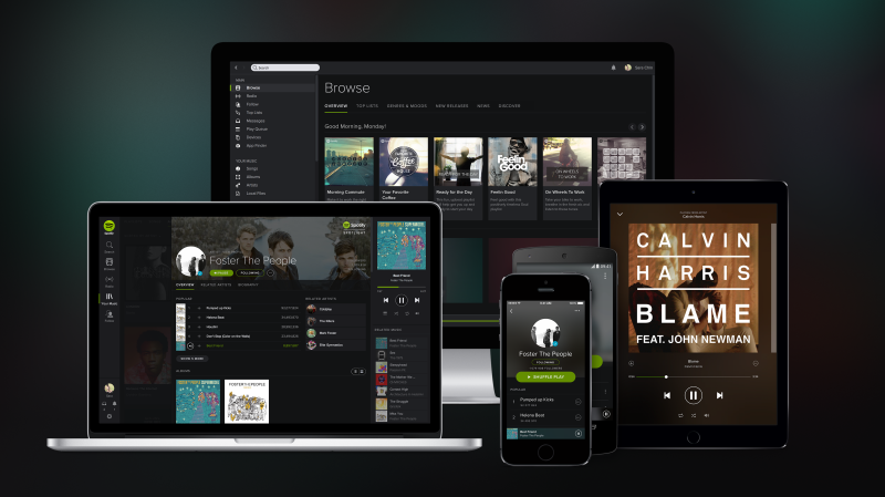
These questions will help you decide which platform to launch your product on. Most businesses will require a website and an Android/iOS app – but only a few will require a smartwatch interface. For instance, if you wanted to launch a shopping app, your team would not be focussing on smartwatch functionality.
Designing mobile experiences can be tricky. Take a look at these:
Key considerations when designing for different platforms
Following are some of the critical considerations when designing a multi-platform product:
1. Screen Size
When designing a cross-platform experience, the first consideration is adapting various elements, features, and layouts to the different screen sizes. It is easy to design for a desktop as you have a lot of screen space. However, when designing for smaller screens, like mobile phones, you must carefully prioritise which design elements to feature in the limited space.
2. Interaction and Accessibility
It is vital to take into account how users interact with each platform. Maintaining accessibility in your designs is also crucial. People will interact with several platforms in diverse ways, and some might even want to use assistive technologies like screen readers, close captions, etc.
Read more from React Native about making accessible cross-platform applications here.
3. Content Layout
When digital real estate is limited, it is essential to organise information most efficiently. For instance, the screen orientation is usually horizontal and of standard sizes when designing for desktops. As desktop screens are wide, laying out content in columns is logical. However, when designing for a mobile phone, content is usually laid out in vertical (portrait) mode to make it easier for users to scroll. It might also be helpful to design your product when a mobile phone is in landscape orientation, thereby giving the users more flexibility and a seamless experience. On the other hand, smartwatches tend to have compact square screens, offering very little space for content. So, every text, icon and image count.
Consistency – The secret to a great cross-platform experience
Consistency in design is one of the keys to a successful cross-platform experience. On different platforms, you should aim to provide a consistent and seamless interface to the users by considering consistency in the following design aspects:
1. Information Architecture
Information Architecture refers to how you organise information to meet the user’s needs. If done correctly, it can help the users navigate through your product. When designing a cross-platform application, be consistent with how you structure your content. If implementing the same structure is not feasible, try to make the architecture familiar, so users don’t have to learn about the workings of your product.
2. User Flow
Don’t try to re-invent the wheel of user flow every time you design for a new platform. It would be best to repeat an established and consistent user flow to make the users feel comfortable when interacting with your product on various platforms.
3. Language
Your language can define how users see your product or your brand. It is crucial to use consistent language and tone to communicate with your users. Refrain from using dissimilar diction across various platforms.
4. Brand Colours
Your product’s colour palette might be the most recognisable aspect of your design. Maintain it across various platforms to deliver a more cohesive experience to your users.
In a nutshell
One can experience a product on various devices. A UX designer’s responsibility is to translate the requirements of cross-platform development into a unified and intuitive interface on all platforms.
No matter which device you are creating your new application for, it is vital to keep your user in focus and implement the four characteristics of good UX design: usable, equitable, enjoyable, and useful.

Pingback: Why You Should Optimize for Both Mobile and Desktop When Developing Your Website - noupe